My old homepage said, “Helping you build better WordPress websites.” It had a Say Hello button, a YouTube Channel button, and a grid of recent articles below. That made sense for the site I had at the time. I was publishing WordPress tutorials.
But I wanted MansoorX to do another job as well: help business owners whose existing sites had become dated or hard to understand. “Say Hello” gave those visitors no reason to write. The homepage needed to explain the problem I work on and offer a useful first step. The blog still mattered; it just could not be the whole front door.
What the earlier homepage was asking for
A saved WordPress revision from 7 November 2024 has the old headline, the two buttons, social links, and a section titled “Learn from the Blogs.” The content map below uses that revision. It is deliberately a diagram, not a screenshot of the old page.
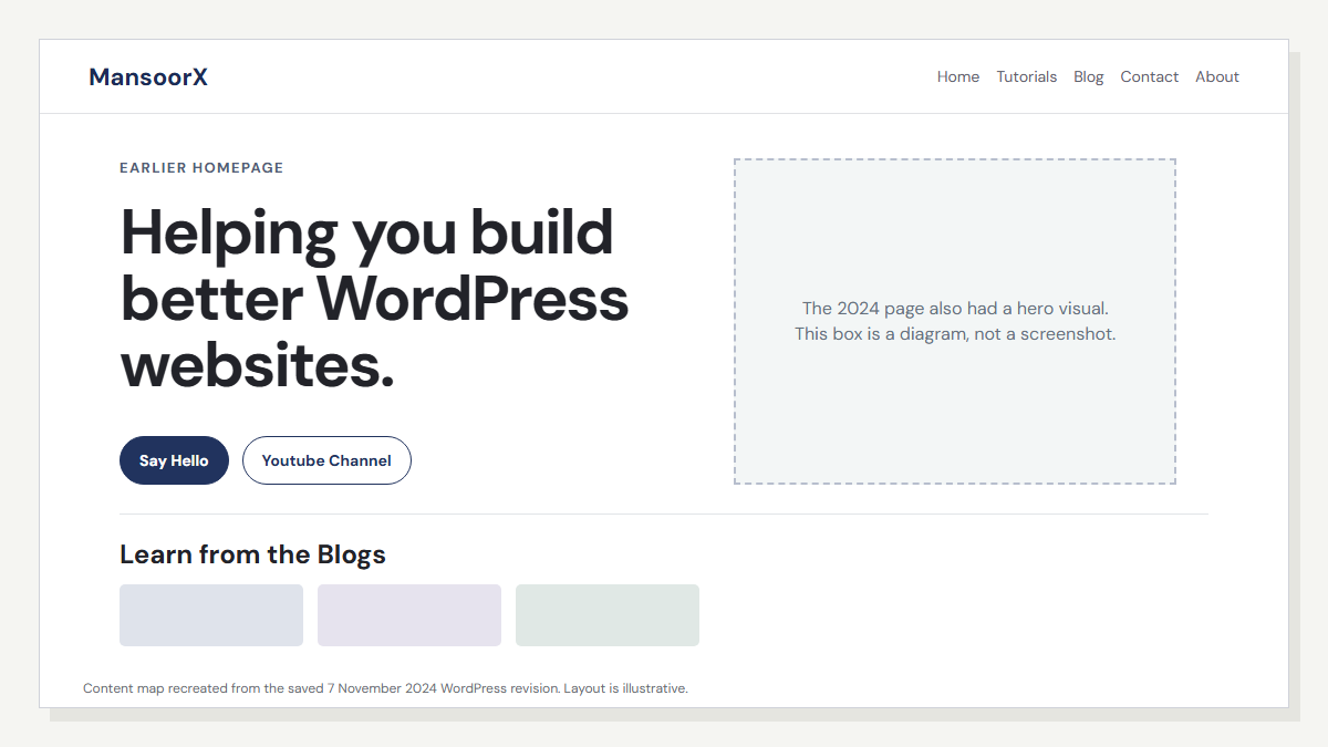
There was nothing wrong with having tutorials on the homepage. The awkward part was making a visitor choose between a vague contact action and a channel for other creators. A business owner with a website problem had to infer whether I could help with their site, and what would happen after clicking.
The new homepage has a more specific job
The current headline is “Turn your outdated website into a reason to choose you.” Under it, I say plainly that I rebuild WordPress sites that feel confusing, dated, or difficult to trust. The main button asks for a three-point website review. Someone who came for the articles can still take the quieter route to the field notes.
I chose the review because it gives a hesitant owner a small, concrete way to begin. They can send a link and receive three observations about what is helping, what is getting in the way, and what I would address first. It is not an automated score or a promise that every site needs a full rebuild.
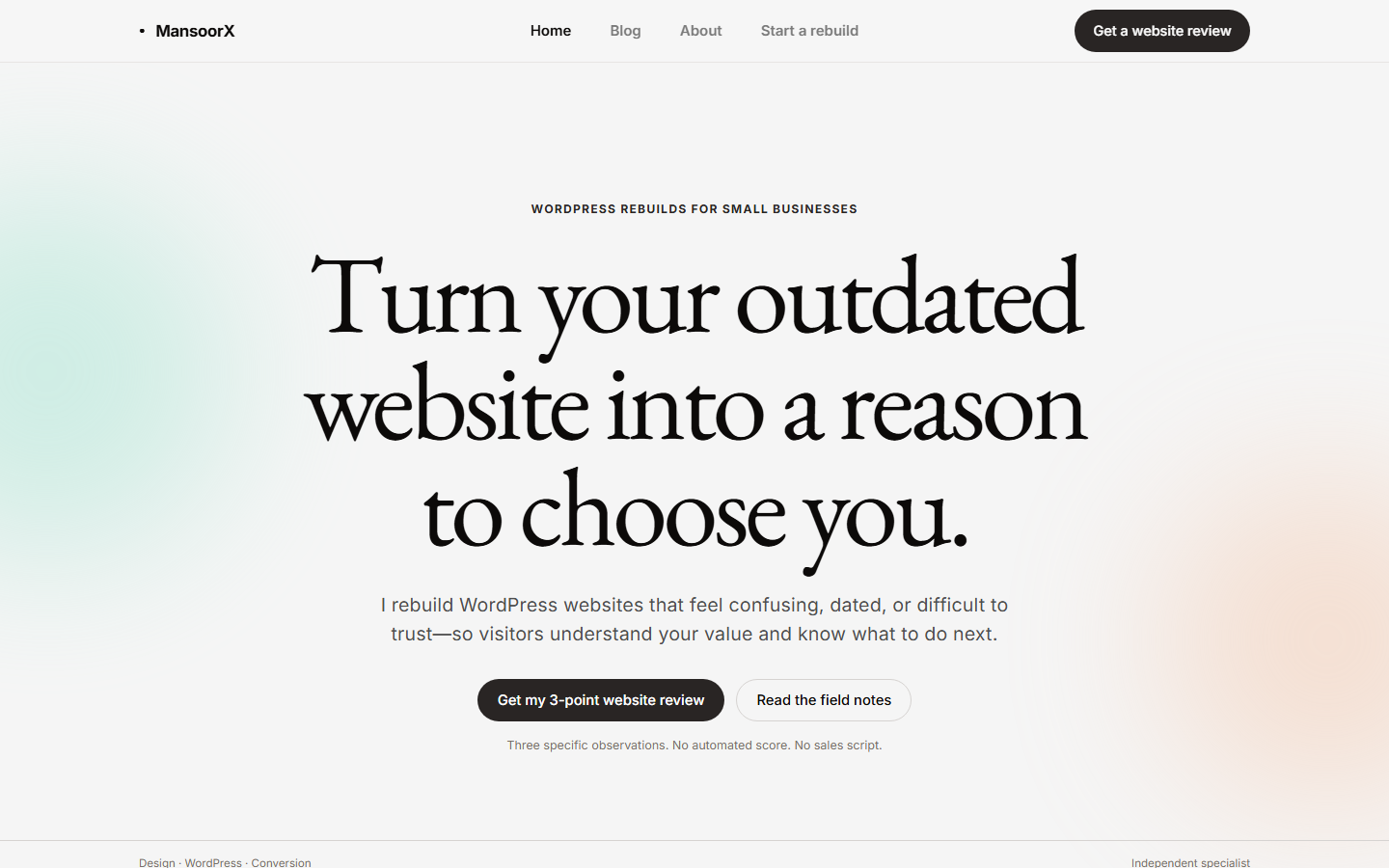
I settled the direction in HTML first
Before the WordPress implementation, I worked through a plain HTML prototype. That made it easier to judge the page as a whole: the first screen, the distance between sections, the reading pace, and whether a second button was competing with the first. The prototype is still in the project folder.
The typography changed with the purpose. EB Garamond gave the large headings a quieter, editorial feel; Inter kept the explanations and controls straightforward. I also stopped treating the old navy palette as something the redesign had to preserve. The neutral canvas and restrained color accents felt closer to the kind of careful, comfortable site I wanted to build for someone else.
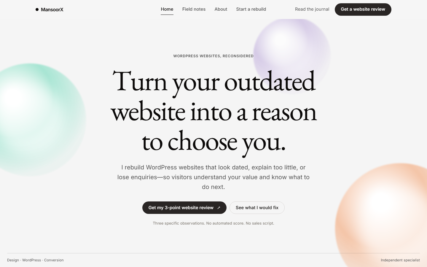
Moving that design into WordPress was its own part of the work. The first implementation exposed layout problems in columns and in the single-post template. A prototype does not have to handle a real archive, old posts, a menu widget, or existing Elementor content. The live site does. I had to deal with those pieces instead of calling the mockup finished.
The blog did not disappear
I kept the WordPress articles and their existing URLs. The blog archive now has a clearer job: help someone find a tutorial, comparison, or fix. An article can answer a search question without pushing a rebuild enquiry into every paragraph. The About page carries more of my story. The homepage stays focused on the business owner looking at their current site and wondering whether it still represents them well.
That separation matters to me. A person trying to fix a 503 error should get a useful answer. A person considering a rebuild should understand what I would look at first. They may be the same person eventually, but they did not arrive with the same question.
What I can say about the result
The new site gives the review one obvious place in the header and the homepage. The language is narrower, the blog has its own route, and the visual system is more consistent across the pages I have rebuilt. Those are changes I can point to. I cannot honestly say the redesign increased enquiries yet. That needs a working measurement period and real submissions, not a before-and-after graphic.
If you are thinking about your own website, I would start by deciding what the homepage should help a visitor do. For MansoorX, that answer was not “read everything I publish.” It was “show me the site you are worried about, and I will tell you what I notice.” Once that decision was clear, the rest of the page had something to organize around.
If your WordPress site works but leaves people unsure what to do next, send me the homepage for a three-point review. I will look at the message, the first impression, and the next step a visitor is being asked to take.
Image note: the 2024 image is an illustrative content map made from a saved WordPress revision. The prototype and live homepage images are screenshots captured for this article. No traffic, lead, or conversion improvement is claimed.